Help
Table of Contents
|

General Help InformationThe complete help manual is accessed from the User banner by clicking on the
question mark Alert List: The Alert List is an internal reminder system. It displays when you first log in to CME or if you press the Alert List button on the navigation panel. See help for alert list form Alert List Help Banners There Are 2 banners in the system, a case specific banner and a non case specific banner.
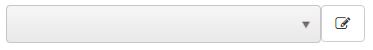
Field Colors: This section will describe the different field colors and what they mean. Yellow Outlined Fields: Are required fields. Meaning they will need to be completed before the form can be saved. Red Outlined Fields: If data is entered incorrectly, the result will be an error message. Which will be displayed upon trying to save the form under the field. For example, an invalid ssn number. Grey Fields: Grey fields indicate a field that is either a dropdown or a disabled field. Drop Downs, Tool Tips and Labels Drop Downs: Drop downs can only be managed by a user with system admin rights. If you do not have system admin rights you can suggest a choice to be added to the drop down. Hover over the arrow in the drop down and a plus sign will appear
You can type a description and a comment that the system administrator will see so they will easily be able to accept or reject your suggestion. Tooltips: Tooltips can only be managed by a user with system admin rights. If you do not have system admin rights you can suggest a tooltip. Hover over the label above the field and a sprocket will appear. You can type a tooltip[ that the system administrator will see so they will easily be able to accept or reject your suggestion. Labels: can only be managed by a user with system admin rights. If you do not have system admin rights you can suggest a tooltip. Hover over the label above the field and a sprocket will appear. You can type a tooltip[ that the system administrator will see so they will easily be able to accept or reject your suggestion. Memo Fields and Spell Check This section will describe the functionality of the memo field. Outside of the memo field spell check is supported through the browser
Grids This section will describe grids and their functionality
Viewing: To keep performance of the system optimal the grid defaults to showing 20 lines per page if available. This can be changed by the user and the system will remember the change for that user for the specific form.
Filtering: Grids have filter capabilities user must click
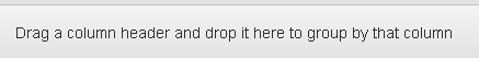
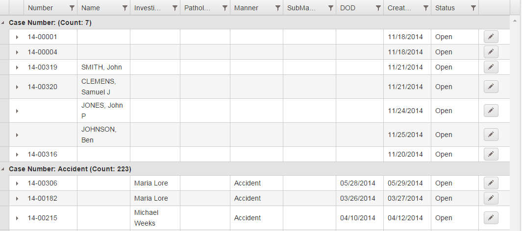
This is example of popup after clicking filter icon. User can pick from choices in drop down and enter the value into the field they are looking for. User can combine filter by choosing and/ or and adding additional criteria. Grouping: User can group the grid on any grid column. User must select and hold a grid column and drag to top of grid into according space.
After grouping grid will show counts of each row, example below shows grouping on manner.
Additional Information: The grid can be expanded by using the triangle button
Edit, Delete and Go Options:
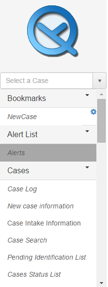
Menu, Bookmarks and Case Number drop down Menu: The menu will be a specific set of forms based on the role of the user who is logged in. Some forms cannot be accessed without a case number having been selected.
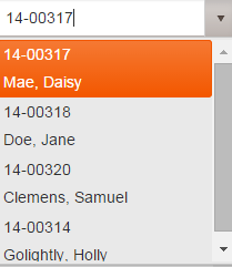
Case Number Drop Down: The Case Number drop down will allow quick access to the last 10 accessed cases per user.
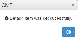
Bookmarks: You can create a list of ‘favorites’ forms, creating a personal menu for yourself by dragging the forms that you use most frequently to the Bookmarks section. Within the Bookmarks, you can also select a case related form to be your default form. The default form is the form that will open after you have selected a case. Once you have a form in your bookmark menu you will be able to click a sprocket to see a popup to set the form as the default. System will message after completion. See images below.
To remove a book mark select the sprocket and choose remove. General Navigation Information Overall Description This help form will help the user navigate the system. It lists out areas which are common to multiple forms found in the system. Required Fields A required field is denoted by having a yellow border around the field. This field MUST have a value before the form can be saved.
Drop Downs vs Combo Boxes A drop down is a field on the form with a grey background and an arrow. The user can only select a value found in the list.
Multi Select Controls A multi select control alows the user to select many options from the list. Each selection has a small X at the end which can be clicked to remove the selection. Additions can be made
by clicking into the white space on the control.
Date Control User can interact with the date control in a variety of ways. User can type the date in with / or without / (please not if you are not using / day and month must be 2 digits). User can also use [Alt]+[Down arrow] to bring up the calendar. User can select current date by using space bar. User can navigate through calendar Contacts Overview: Contacts can be entered directly on form Contacts NOK or on forms that have a contact drop down. All contacts regardless of where they are entered
will be visible on form Contacts NOK. Each contact drop down is configured to show a list of contacts based on the contact type(see system administrator guide for how to configure contact types). |
 symbol. Additionally each form in the system has help related specifically to that form. You can click on the
question mark symbol
symbol. Additionally each form in the system has help related specifically to that form. You can click on the
question mark symbol  alongside the form title to bring up the help applicable to that form.
 : Button is used to collapse the navigation panel
 :Button is used to save form
 :This will reference the user name
 : Button is used to logout of the system
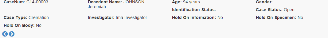
 : If you hover over the arrows the titles Previous Case and Next Case appear. Click on either arrow and this will take you to sequential numbered cases and populate their information in the form you currently have open.
 After pushing plus sign popup will appear
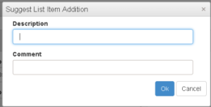
 After pushing sprocket popup will appear
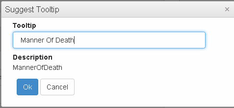
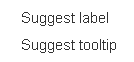 Select Suggest tooltip and another popup will appear.
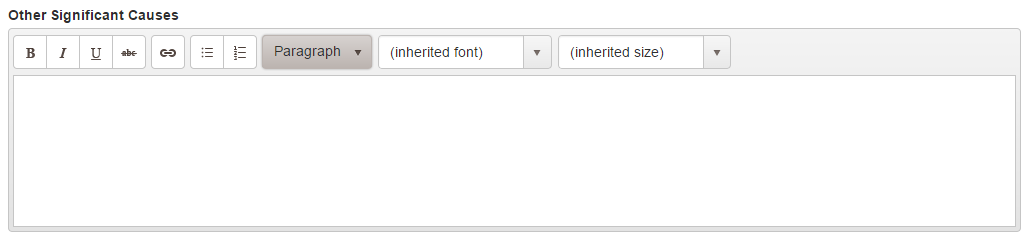
 : Button is used to bold text.
 : Button is used to italicize text.
 : Button is used to underline text.
 : Button is used to strikethrough text.
 : Button is used to create hyper link.
 : Button is used to create bullet lists.
 : Button is used to change the style of text.
 : Button is used to change the font of text.
 : Button is used to change the font size of text.
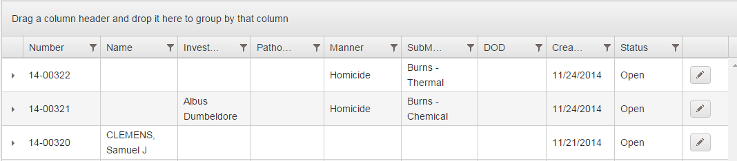

 : Button is used to return to the first page.
 : Button is used to return to the previous page.
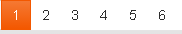 : Buttons indicate which page are available. Orange number is row you are in, each number can be selected to jump to that page.
 : Button is used to advance to the next page.
 : Button is used to advance to the last page.
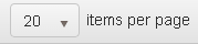 : Button is used to indicate how many rows per page. This can be modified by the user.
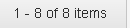 : Label will show how many rows are totally available.
 to open filter popup.
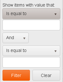
 . This will
expand the grid row see example below.
. This will
expand the grid row see example below.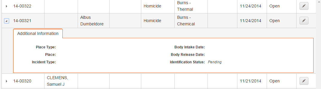
 If you see this button on a grid it means it the row can be edited
 If you see this button on a grid it means it the row can be deleted
 If you see this button on a grid it means you can be redirected to a form for the selected case.